3.1 Viewing Highlights
timegram gathers logged data from the Highlights app and displays it on your main dashboard.
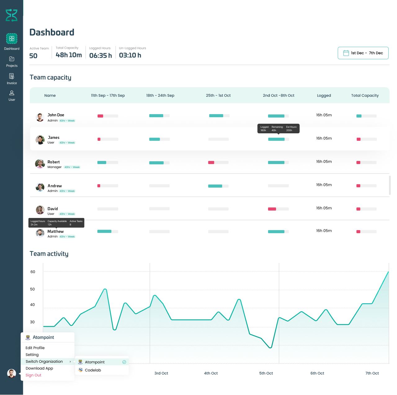
You can see the daily work rate of each user based on their set capacity. When a user logs activity, the daily work-rate bar will fill accordingly. On the right side, you can see the total hours logged in that particular week, followed by the total capacity of that user.
For instance, the Content Marketing Manager of timegram has completed 7 hrs 34 mins (21.63% ) of his weekly working capacity. He completed his daily working capacity on Jan 30th (the bar is full for this date), and is yet to complete 78.37% of his weekly hours to fill the total capacity bar (in which case the rightmost bar will turn from red to green).
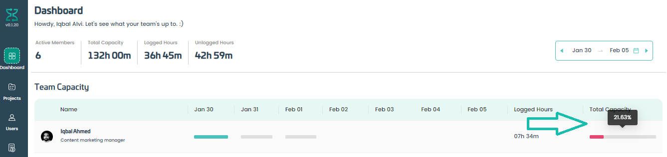
The total capacity of the user represents the total number of hours a user can deliver each week. As the user logs hours, the ‘Total Capacity’ bar will fill accordingly. Ideally, this bar (and all the daily-log bars behind it) should be full (green) by the end of the week. This would mean that the user has met their daily and weekly capacity for that week by logging the required number of hours.
Hint: if you hover over the ‘Total Capacity’ bar against a user, it will show the percentage of logged hours in that week.
For example, if you’ve set an employee’s weekly capacity at 40 hours, and you hover over the Total Capacity Bar of a user who has only logged 30 hours during that week, it will show you a completion rate of 75% for that particular user.
For a detailed overview of an employee’s performance, click on that employee’s name to open that user’s performance report. Learn more in ‘Insights and Reporting’ 8.0